Thursday 12 February 2015

Illustration Friday: Noise


Why hello there.

I'm trying to get back into the habit of producing illustrations for Illustration Friday's weekly theme. Although this week, considering the time it is now (10pm - oops!), I'm only just going to get it posted in time before a new theme is released again tomorrow! I work best on a tight deadline??!

This weeks topic was Noise. Never one to draw the obvious (although I do love a good ole' fashioned Boom Box), I decided to draw on my own experiences and my Psychology Degree (I try to use this in an attempt to justify the debt I have hanging over my head)!

Curious,  you may think. 

Yes, perhaps so.

So, here's the picture and I'll explain my minds workings after. 


This illustration was never meant to be perfect or picture-book-quality. I just wanted to get the idea out in the open, and fast. 
A 'Posh Doodle', if you like(can I coin that term?)
Although, I feel it has a certain charm about it. 

Hold on, I'm going to get a bit deep about this Posh Doodle now. 

Children often get overlooked when it comes to mental struggles and inner woes. I wanted this illustration, drawn in a style perhaps suited to a children's book, to convey that inner struggle that no doubt we have all felt from time to time throughout our lives. 

Yes, that moment inside your mind where even though your surroundings may be silent, you find that for whatever reason your mind is working overtime and won't shut the hell up. 

Ruminating perhaps on notions which are not made of sunshine, but rather of rain clouds and storms. Our inner thoughts and monologues can prevent us from feeling calm, and take us away from the ability to feel silence. So thus, this is what I have attempted to depict. A frustratingly busy mind which can be saddening, something which people can experience from a fairly young age. 

The wording within the illustration is my own: "It gets so noisy inside my head, I wish that it would shhhh...so I can have some peace and quiet instead." 
Originally, it was without text...but this popped into my head when I started to wonder what the girl in the image was thinking - and I found it rather fitting, and again, I felt it had some charm.

So there you have it. A Posh Doodle, turned into an essay. 

All in an evenings work. 

Thoughts and comments are always greatly appreciated. Genuinely. I have no idea really what I'm doing here - other than sharing with you a little snippet of my mind's cogs and creations!

Til next time,

Em

x


Monday 9 February 2015

hello again!

...aaaand I'm back!


So after a small break from blogging, mainly due to:

A) Switching jobs (twice)
B) Having a silly laptop that wouldn't work

I am now back - for good! 

I've even set up a new Twitter account to shoot out all my latest creations (and see other peoples too, of course). 
You can follow me on Twitter here!

However, although I may have been having a 'blogging break' I have certainly not been having an 'art break'. No,no,no. In fact, arting about is also what's been consuming much of my time. I now have exciting new digital drawing programmes and other arty materials which I have been joyously playing about with most days! 

To further fuel 'said excitement' I was recently asked to do a collaboration with the talented Blogger and fashionista Nikki McMullen for her February Post SS15 Trends. I loved the brief and rose to the challenge of creating 12 illustrations for the upcoming fashion trends of 2015 - and whilst it was a slight challenge (these are my first 'proper' fashion illustrations) - I absolutely loved it.

 Indeedy. I can't wait to collaborate with this talented writer again. 

So below you will find close ups of my illustrations used for Nikki's  latest blog post:

Nikki's Notebook

Collaboration with Emma Perry: SS15 Trends

(if you click above it should fly you straight there)


P.S The two illustrations just below are my personal favourites!
P.P.S That's why I made them bigger!!

Above: Elie Saab
Above: Elie Saab

Below you'll find the rest with some close-ups of the fabric detailing. Enjoy!

Above: Michael Kors
Above: Tommy Hilfiger

Above:Elie Saab
Above: Elie Saab
Above:Michael Kors
Above: Kate Spade
Above: Maison Margiela

Above: Donna Karan


Above: Oscar de la Renta
Above: Bibhu Mohapatra


Thank you for taking a look!
It would be great to know your thoughts of said illustrations, so if you'd like to comment below that would be splendid.

Until next time.

Em
x

Thursday 6 November 2014

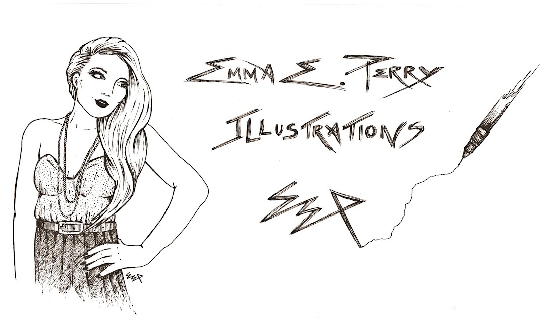
My New Blog Header!

As promised, I now have a fancy
new illustrated blog header 
...by me! 

Please see the MASSIVE picture above showing a little illustration of myself with hand scribbled typography!

For those of you who may be intrigued, the image is hand-drawn using a fine liner -
 which also explains why I incorporated one into the design; nothing random there my friends.

ALSO, I have now enabled comments...(I think) so that anyone can share their thoughts on my
 drawings/ramblings/probable cat pictures.

It would be great to know what you think of the new header!

'Til next time, 
Emma


Thursday 23 October 2014

Illustration Friday: Trouble

...well, Wolf Trouble.


This week, Illustration Friday's theme was Trouble: a hugely ambiguous topic with plenty of scope for individual interpretation - my favourite! 

So, after a little ponder and a dabble on my doodle pad, I came up with the below drawing entitled: 'Wolf Trouble'. However,in this visual snippet it's debatable as to who's going to fare worse, and who is really in trouble.  


In my previous post, I drew a picture using a similar colour pallet and line techniques; I suppose the below image is an extension of that original style experiment, and boasts(I think)a more pleasing composition. 

As you will see, I have used colour sparingly, only using red  highlights to draw the viewers focus to the two 'weapons'.

'Wolf Trouble' by Emma E Perry 


Below are several close-ups of 'Wolf Trouble' to show the various details. The original was created on A4 plain paper, using a 0.3 sized Fine Liner and a red Promarker.


Close-up of the small lines used to depict fur.

Close-up displays the subtle change in
line direction used to emphasise the
contours of the wolf's jaw.
 Red is used to draw attention to
 the wolf's weapon: his teeth. 

Further close-up of the wolf's jaw,
 showing the subtle line changes. 

Close-up demonstrates how the wolf's shape
 was created not by using a solid line,
 but instead a careful grouping of smaller lines.

Close-up detailing the change in 
mark-making from wolf to girl.

Red is used to draw attention to
 the girl's weapon: her axe.


Shoe detailing
 - sorry the feet got slightly cropped!

Basket detailing with contrasting mark-making.

Thank you for taking a look!

Be sure to check back soon as I'm currently creating a new blog header and background!

Till next time, 

Emma


If you like what you see...
Follow me!


Sunday 19 October 2014

Oh look , a werewolf drawn out of lines!


Ok, so the scanning in of this drawing didn't go as well as I'd hoped - but you get the general idea!

In this 'experimental' picture I played around with the use of broken lines, which were then grouped together to create a solid shape. Whilst this process is rather time consuming and repetitive, the results can be pretty pleasing.

I toyed with this style of illustration during my Foundation Diploma in Art & Design (after an impulse buy of multiple fine liners), and I'll definitely be experimenting more with this style soon (yes, I have just bought more).

Below are some close up sections of the werewolf so you can see the line work in greater detail - please ignore the bits of fluff stuck in my scanner!


If you click on the pictures it enlarges them even more.

Till next time, 

Emma 

Thursday 16 October 2014

Illustration Friday: Octo-Puss

'Octo-puss' by Emma E Perry

So with my motto 'be brave and start sharing' still resonating strongly in my mind, I have decided that one way to do this sharing business is through art-focused online platforms such as illustrationfriday.com. On this 'art gallery' style website a new topic is thrown out each week for followers to interpret in their own individual way, and these creations are then uploaded for all to see. 

It's a fantastic way to get your artwork shown, but also allows you to throw out your appreciation for the other ingenious pieces displayed! More importantly, ANYONE is welcome to publish on this online art exhibition (so you really have no excuse either!).

This week Illustration Friday gave its avid viewers the topic of 'Octopus'! And whilst it probably would have been far easier to draw a simple octopus (perhaps even sporting a top-hat or monocle),I decided that with it being the month of Halloween a slightly freakier critter was in order; thus leading to the birth of Octo-puss (same pronunciation as octopus folks!). 


Whilst I am almost definitely not the only wondering mind to have been tickled by the pun within 'octopus', I like to think my drawing is a slightly less obvious (although probably more disturbing)take on it!


I apologise now for the background marks, and the colours are not as strong as on paper - but I am yet to acquire decent editing software! 


Hope you enjoy, and maybe I'll see your pictures up on Illustration Friday next week!


Emma

Wednesday 15 October 2014

Welcome!


Welcome to my long overdue illustration blog!

I confess, it has taken me a long time to get this blog up and running due to one core fear – not being ‘good enough’ at drawing; a fear which I suspect is felt among many aspiring artists alike.

I have found that whilst the internet (and books) can provide a great wealth of inspiration, and enable insight into other artists’ works, it is easy to become almost overwhelmed by the sheer volume of talent out there.  Our human nature compels us to compare ourselves to others, whether we do this consciously or not, and this unfortunately can lead to us doubting our own talent.

Even until recently I would find myself producing what I felt was a reasonably good drawing, but then after going online and viewing other artists work I would suddenly feel disheartened with what I had achieved.  Furthermore, the more art I created, the more infuriated I became at myself for constantly putting my own work down.  I knew that I would get nowhere with that attitude and so I had a good ole’ rethink!

I decided that, for me, illustration was not about perfection, but about expression instead.

I know I am not the best artist, and I would be conning myself I tried to convince myself otherwise. However, one should always remember the saying ‘I may not be the best, but I am not the worst’. Besides, art will always be subjective and it is not a competition (unless stated in T&Cs haha) – and there will always be someone somewhere who will like what you've produced – no matter how shockingly poor you think it is!!

Mostly, we are our own inhibitors of our drawing success – the fear of failure coupled with the lack of self-belief act as restraints on what should be a completely freeing process.  

So, I came up with a motto for the next year regarding my illustrations:

‘be brave and start sharing’

Acting on this motto will hopefully help me to overcome that debilitating fear of not being ‘good enough’, and maybe with art being subjective and all, some of you may even like my illustrations (and rambling writings)  – but also what I would really love to do is hopefully inspire others to disregard that ‘drawing fear’ and feel uninhibited when that pencil touches that paper!

Anyway, in keeping with my motto I now share with you two little ‘practice sketches’ I produced a little time ago. I used pastel pencils (which are lots of fun) with a simple biro outline – hope you enjoy.

Emma

Practice 1
Practice 2